Mobile app design inspiration
Facing the design of applications for mobile platforms, UI / UX professionals are often limited to “hidden parameters.” Native development means using standard tools and following the rules, sometimes it’s not clear, but the overall concept should be understandable for both hard-boiled users and the newcomers. In addition, everything should work lightning fast, smooth and be intuitive and clear.
And since designers need a little mobile app design inspiration, this article will guide through the thorns of principles and basic concepts of user interfaces and show some design tips for creating mobile app. Now let’s proceed to the basic design concepts and the way of getting it done perfectly. Guess this link UX/UI design services might help in solving questions like “how to design a mobile app”.
UX/UI design tips
- Follow the trends
The main thing to know about design before you hire UX designers is that it’s fully dependent on the trends. From skeuomorphism with its 3D-like icons, buttons, and other elements, we came to layout design (mostly in web development or typography) and flat design in mobile app development birmingham. More than that – to custom philosophy like material design, when almost every single element is a physical object and have its own purpose;

- Know your user
In order to provide the right product you need to know your target audience, so it would be great to work out use cases and also know the personas. Besides, do not forget about experience maps. Pay attention to such things as demography and the age of your audience. Sometimes it’s important to launch alpha or beta testing, to collect all the necessary information you might need about usage patterns or time in the app. This will help you understand what users really want and what they really need in case of the design;

- Remember about screens
Like it or not, but in web or mobile apps users still working with only one screen at a time, no matter what platform they often use – desktop or mobile. So, it’s important to create screens which will contain only necessary information and will move the user to another one slightly.

- Simple and understandable
Remember that your app is for everyone – from newbies to pros. So, keep it simple and understandable, many users are not interested in flogging a dead horse, trying to discover what to do. Simply launch and start using, without tutorials. It’s all about the design and user behavior patterns: most people know that tapping on the button will cause some action and scrolling from side to side or from bottom to top will perform some other operation. Elsewise you can mark all action buttons with one color and place them in the same position from screen to screen;

- Visuals
As it was mentioned before – critical interface elements should be highlighted, in this way it will focus user’s attention. Make important elements bigger than others, colorize action buttons with different tone or underline keywords;

- Keep the size
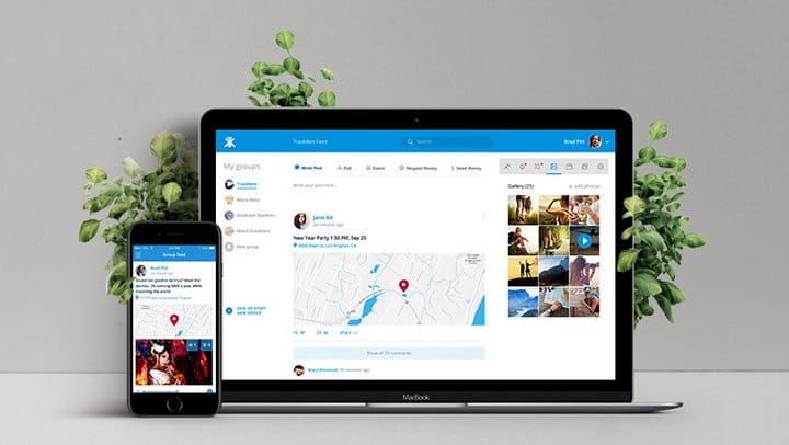
One of the most important UX/UI design tips is – keep the size. Like it or not, but it’s strongly recommended to adjust your app to every screen size it might be used. The fragmentation on modern mobile market may cause a headache even on one platform like iOS which has not so many devices, unlike Android. So, try to stick to the rule that your application should look familiar on almost all of them – use analytics (like Google Analytics) to define the most important information;
- Make user experience better
It would be great to use animations, vibration or sounds along with a certain action or the button click in your application. So users can accurately understand that their action led to the result and it applies to every interaction. Try to make some feedback from the app like changing the colors on tap or moving bars from side to side;

- Awareness
If you’re planning to develop a multi-platform application, it’s worth nothing to say that it should look almost the same on every platform or device. Of course we are not talking about cloning the app from one platform to another, just try to draw some similarity between them. In this way, users will be pleased with it;

- Fonts
Fonts are not just a matter of taste but also of the brand. Cartoon fonts are not suitable for a bank application and vice versa. Try to use well-readable fonts (from 12pt), which don’t irritate the eye.
- On-screen keyboard
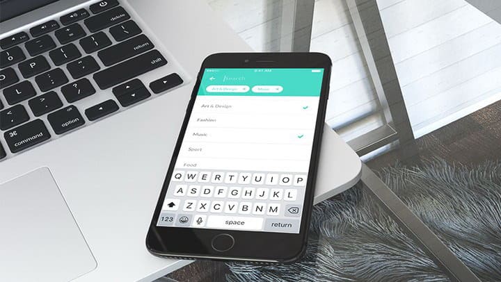
Yet another designer’s headache. Trying to create unique ideas designers and developers are often forgetting about few screens that use keyboard. Unfortunately small mobile screens cannot propose enough space, so it’s necessary to remember that on such screens you have to deal with some troubles and you always have to be sure that it has all essential information;
- UI position
To see the whole picture let’s imagine how usually UI elements are placed and how we hold the device. The most common position for the primary app buttons is somewhere near the top of the screen, much because of it’s accessibility. Moreover, it’s ok because people use their phones preferably with the right or the left hand and a thumb. Therefore, it’s important to place some action buttons like “ok”, “back to top” or “send” buttons at the bottom-right side of the screen.
- View
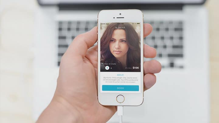
Using a huge number of colors on one screen can harm user experience. In general, at first, it’s nice to use colors from the guidelines, which are designed just for the best use of the application. Or, if you are confident in your abilities – you can try to use high-contrast themes for your applications;

- High resolution images
As we have talked about the right screen resolution and UI position, now it’s time to think about images that may appear on the screen. Not a secret that modern devices have awesome high resolution screens (from fullhd and above), so try to avoid pictures with less than 264ppi – it will look ugly and pathetic;

- Official Guidelines
It’s not a shame having recourse to the help of official guidelines. But it is worth saying that these are only valuable advices for constructing design, but not a clear guideline to drive the process, so stick to the plan and be creative.
Things to keep in mind
In order to make user’s life better and their interaction with the application easier, you might need to know such tips from Applikeysolutions.com:

- Fingers and buttons
One of the often unrecorded factors is the anatomical structure of a person and their hands. While making design, the position of the interface elements must be taken into account. For example, if you quickly use your smartphone when walking, you most often use it with one hand. However, when relaxed – on the contrary, with both hands. Actual average size of the finger equals about 50 pixels but guidelines still trying to bring us round that fingertip equals 44 pixels.; - Use hardware features
For a complete immersion of the user in the process of trying the application out, it is preferable to operate the built-in functions that allow the software to interact with the hardware. These are gestures, taps and also vibration or Force Touch and Taptic Engine as it called by Apple. User will be pleased to use the application with proper implementation of such functions; - Feedback
Trying to create the perfect design, it’s worth keeping in mind that users may not share the designer’s beliefs. Therefore, it is necessary to carefully collect proper usage data and plan the development of not only the functionality but design either;
Conclusion
Mobile app market is the devils can of rapidly evolving technologies and concepts, which spins a lot of related technologies and industries. Design, in turn, plays a primary role in the popularization of mobile applications and services. At the same time, with the development of technologies and user “wannabes”, different design concepts began to develop either. Therefore, for today, creating a design is not just drawing icons. This is a volumetric process, which involves presence of many specialists, market analysis, user behavior and multiple testing.
